What Is Your Shape Vocabulary?
We all have an innate visual language that can be explored, developed and enriched. Some shapes appeal to us more than others, and some actually speak to us directly. Even though we sometimes can't execute the shapes or paint application we strive for in our paintings, we still know what makes our heart sing when we see it.
What you may notice is a kind of repetition in your work, hard edges versus messy edges, curved shapes or geometric shapes, maybe rhythmic patterns. These are signals, that can develop into a more refined language. All shapes have a life of their own and evoke an emotional response. There are a few things we can look for when evaluating the effect our shapes have in our work.
For example, smooth, flat, horizontal shapes give us a sense of stability and calm.
Take a look at this Sean Scully painting. The work features horizontal stripes inspired by nature's horizon line. Stacked on top of each other, the rectangle blocks line up against each other to fill up the space. The forms seem to interlock with a gentle force. The rhythmic shifting and limited dark,/light palette create a simple image. And although the stripes do not line up evenly, they do not create an unexpected painting, but one that presents an even kind of stability. A balance between calm and vitality.
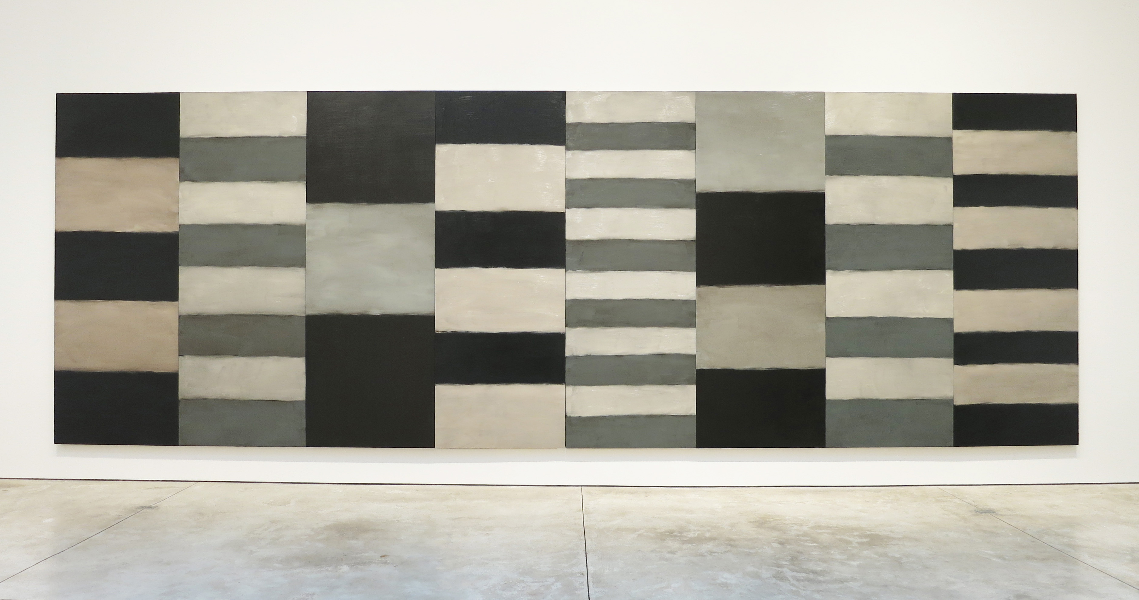
Sean Scully, Night and Day, oil on aluminum, 110 x 320 inches, 2012.
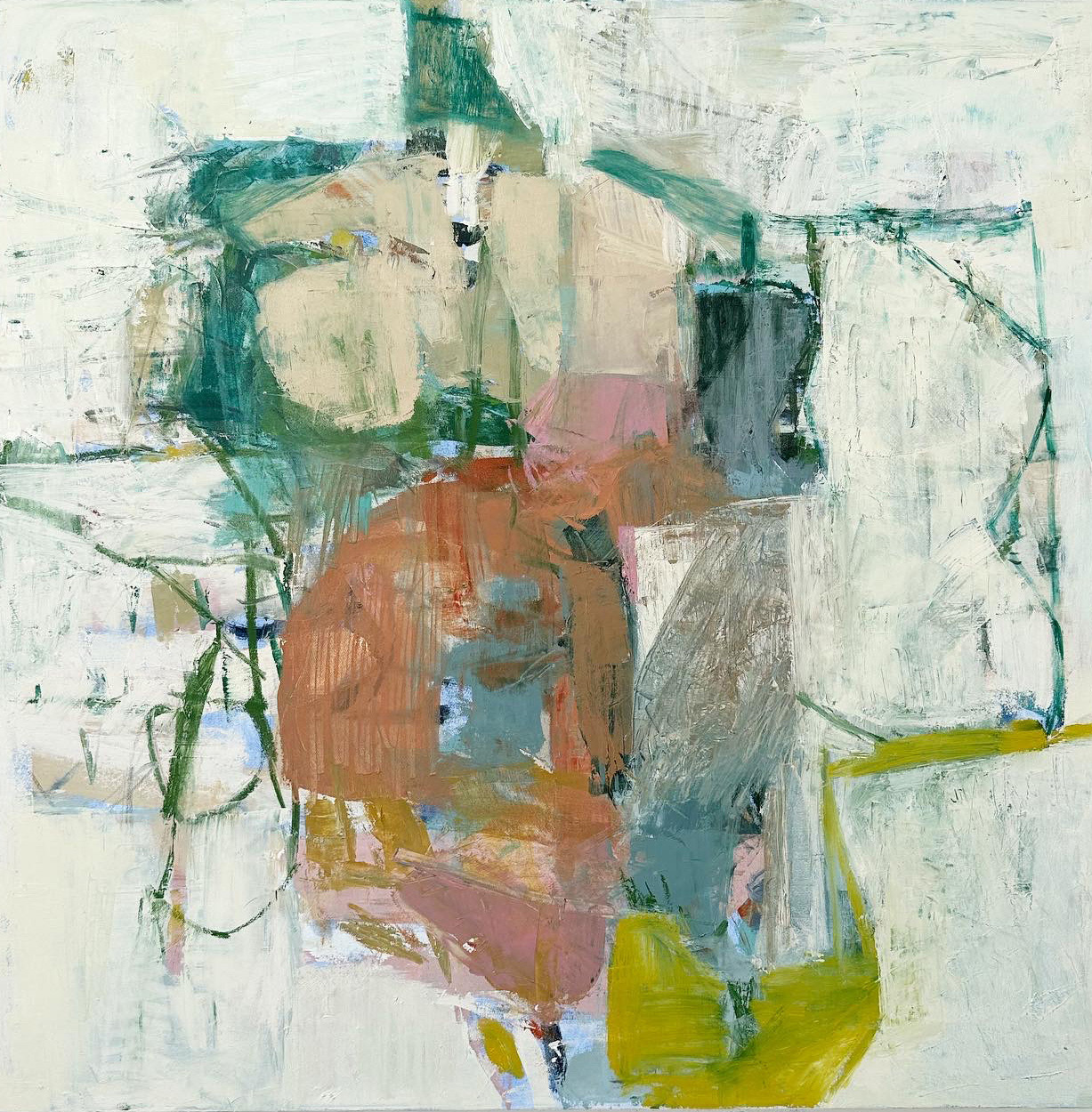
Vertical shapes are exciting and active. They imply energy and reaching upwards. Below, in Looking/Seeing, the composition consists of a variety of stacked shapes, arranged purposefully, one on top of another. They even break through the horizon line, stretching up to touch the top of the canvas. The shapes vary in size, in color and in how they connect to one another. These details, and the slight diagonal tilt makes the vertical pillar an intriguing centerpiece. There are some playful appendages that reach out to the sides, balancing the composition, but the main feeling is one of launching upward.
Also assisting with this uplifting feeling is the beige wedge on the right. Cutting in at an angle, it directs the viewer again to look towards at the tower of shapes and also disrupts the monotony of the horizon line.
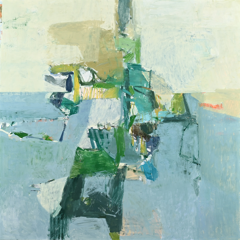
Jenny Nelson, Looking/Seeing, oil on linen, 48x48, 2019
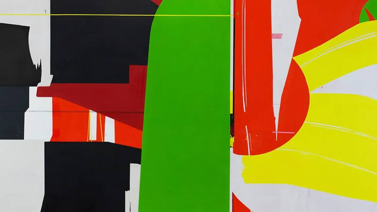
Diagonal shapes are dynamic because they imply motion or tension. Take a look at the Amy Sillman painting below. All of the tension in this work stems from the strong diagonals and powerful color. On the right there is a vertical that runs from top to bottom. Everything in the painting pushes against this vertical. It even bends slightly from the weight. To the left and middle, are a series of strong diagonals, that mostly push upwards, but also form a few defined closed shapes, which keep the viewer grounded inside the painting.
To determine how your shapes are directing you around the canvas, ask yourself, where does my eye land first? Where does my eye go second? Spend a few conscious moments observing how your eyes move around the composition and also where they linger longest. For example, a strong diagonal, with no loop or pathway back into a work, may direct the viewer to exit the picture plane all together.
Amy Sillman: C, 2007, oil on canvas, 45 by 39 inches
Where have you placed your shapes? A shape does not exist by itself. Every mark, line, and shape, respond to and converse with, all other elements in the painting, including the edge of the canvas.
Once you've determined the orientation of your painting, how does the upper half of the canvas feel? Free, happy, powerful? How does the bottom half feel? Heavier, constrained, grounded?
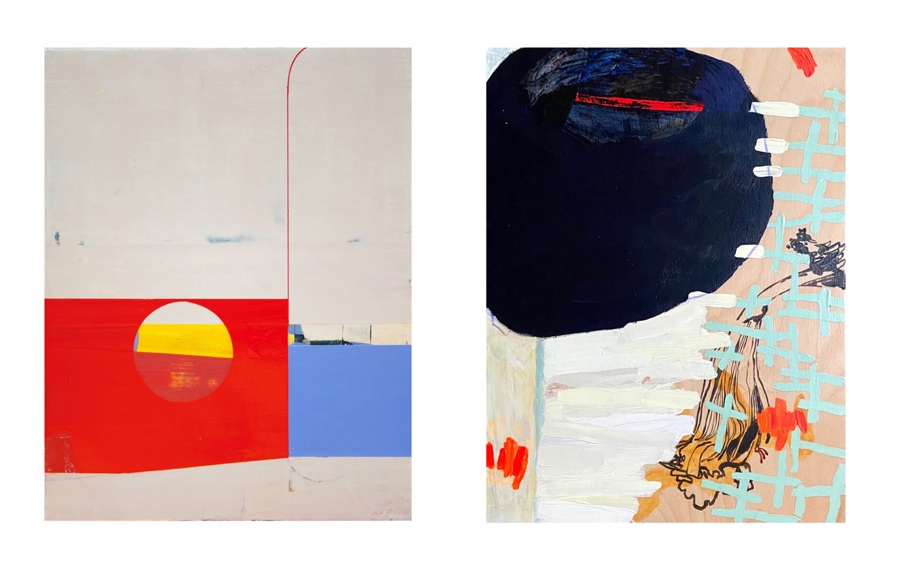
The two pieces below have very different shape vocabularies. One is sparse, with hard edged geometric shapes and the other has a loose, spontaneous language of marks that cover the entire canvas. Compare your response to the geometric shapes placed at the bottom of the painting on the left, versus a big dark shape placed at the top of the painting on the right. I have a very clear response to both!
Side by side, I feel a sense of relief when I view the piece on the left. The comparison makes me see more clearly how impending and heavy the dark shape feels in the painting on the right. The weight feels even greater in the company of the playful, spontaneous marks that make up the rest of the painting.
If you personify or animate your shapes, give them language to converse, it's sometimes easier to know how you honestly feel about them, and then you can make changes more quickly. For example, the dark shape may be saying "I'm coming to get you!", or "I'm taking over this space!" or "I'm too big, I feel uncomfortable up here, please make me fit in!"
The shapes and colors on the left might say "I feel elegant, I am just enough, I feel settled down here" Or, "we've been friends for a long time."
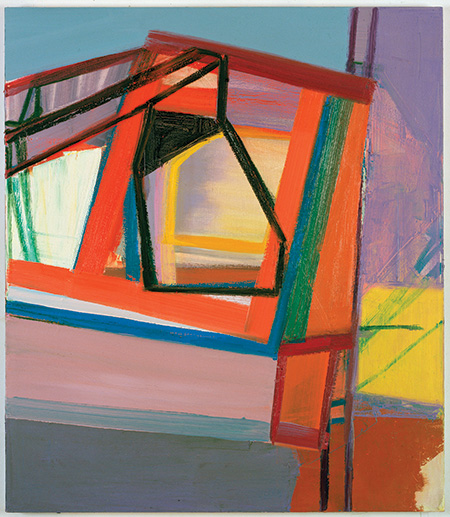
Suzanne Kammin, Portal, 2014, 14"x11", oil on canvas
Ingrid Ellison, Blue Foraging 16x12, 2021, Acrylic on panel
How does the center of your painting feel? The "center of attention" The point of greatest attraction. How do you respond to this blue square in the Diebenkorn work on paper below? Is it grounding, safe, or stuck?
It seems to vibrate! It's electric blue, pushed off to the side a bit, with remnants of earlier attempts left visible just below the surface. What if this blue square sat right in the center of the piece? What if it was opaque and flat? The effect would not be the same at all.
At first glance we may read this piece as simple. On closer examination the transparencies and delicate details add a layer of complexity that looks "worked" and "reworked", lost and found. Simplicity here, has been elevated by an expert hand and eye. So another question to ask might be, are your shapes too simple or too complex?
In constructing a shape, the transparency or opacity, the color, the placement, the edges, how simple or how busy, all play a role. In this way, the deconstructing of your forms, to build and rebuild, to leave traces of your efforts behind, is the foundation of a strong shape personality.
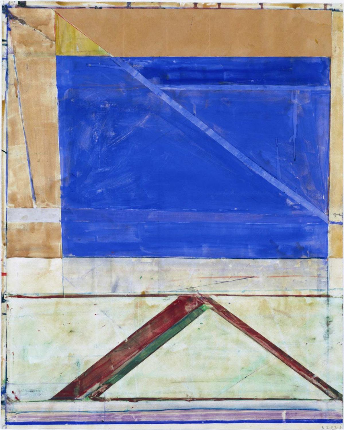
Richard Diebenkorn, work on paper
We can not talk about how shapes make us feel without talking about how they direct us around the canvas. How they move us around a painting, pointing us this way and that, telling us what to look at first, or where to hold our eye steady.
Take a look at this dark triangle of a sail in Under A Cloud, 1900, by Albert Pinkham Ryder. This slim, sharp triangle tells us everything about this painting. The tension is palpable as it bends but, resists. Although it has no shape, the wind is all-present, conveyed clearly by the deep angle of the sail. This push and movement is reenforced by the oval cloud as well, rendered at the same angle. They both point us towards the corner of this small work, yet we can feel the whole sky expand outside of the space. These two primitive, simple forms feel modern, abstract, and powerful ahead of their time. Not to mention, the stark contrast, limited palette and luminous light that make this painting magic.
As a general rule, pointed shapes make us feel uneasy and rounded shapes make us feel more secure and comforted. If these two shapes were conversing, the cloud might be saying "Don't worry, I'm with you."
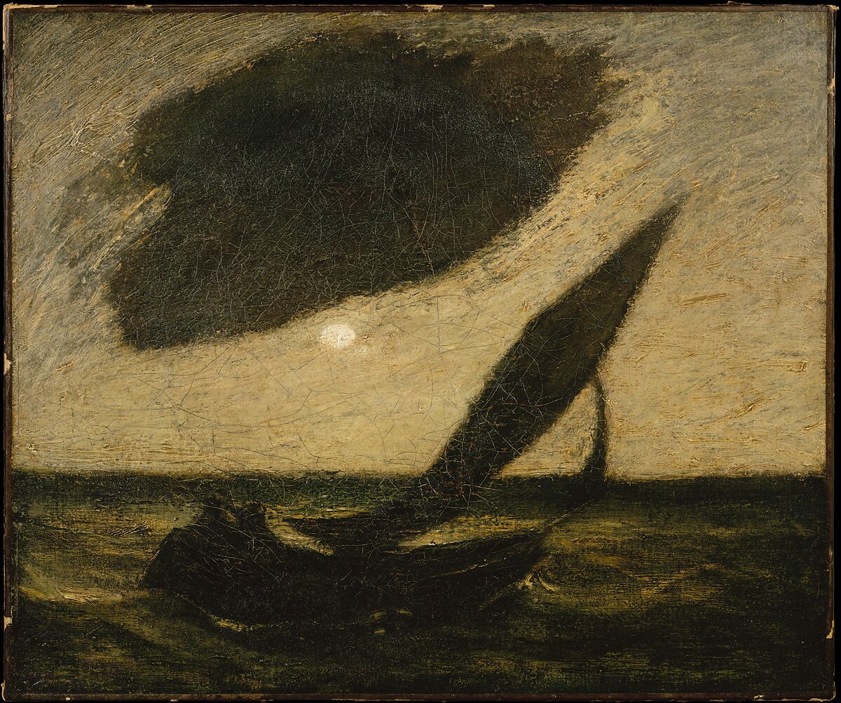
Under A Cloud, 1900, 20"x24"by Albert Pinkham Ryder
Looser shapes feel soft and open. The painting below by Susan Rothenburg has a group of fluid, repeated, and recognizable shapes. These simplified, abstracted rabbits, move in a circular motion around the canvas. A combination of observation, abstraction and spontaneity. It is easy and enjoyable to get lost in this painting. The drawing elements add quick, energetic marks that bring both the shapes and the background to life.

Susan Rothenberg, Pink Paths, oil on canvas 74"x100", 1996
Looking at the rabbits above, the question that pops into my mind is: how much information do you need to give about a shape for it to actually exist and claim its role in a work? Take a look at Gary Komarin's painting, Big Pink. With an almost entirely soft pink palette, the most noticeable shapes appear in the lower right corner. These three small, abutting forms, one saturated red and orange, one an inky outline, and the other a pale yellow, congregate and connect near the bottom of this huge piece.
Other than the dark triangle in the middle left, the rest of the shapes on this canvas float about almost unnoticeable. They are only separated from the background because they are a slightly darker value of pink, or because of some subtle scrubbing over with the brush. Although they are so subtle or because they are so subtle , (when someone whispers, you try harder to listen in!) they command our attention.
I spend a lot more time looking at the big pink shape on the left, than I do at the smaller, eye-catching shapes at the bottom. By including two distinctly different ways of constructing shapes in the same painting, it creates interest and an unexpectedly beautiful balance.
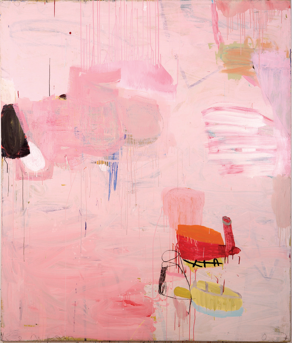
Big Pink by Gary Komarin, 84” x 66”. Mixed media on canvas
Are your shapes open or closed? Or a bit of both? Joan Mitchell's shapes are created by her wild, gestural marks alone. A group of quick, gestural jabs and pokes gather loosely together to create amorphous forms. The edges and boundaries are open and flowing into one another. Some are adjoined only with scratches, smudges or blurred lines.
On the right, Suzanne's painting is more rigid and ordered. Most all of the edges are closed, hard, and geometric. It evokes a very different feeling. The large shape, that takes up most of the canvas is constructed of multiple parts and has vibrant, saturated color. It has a satisfying and commanding strength to it.
It feels balanced, but with just enough imperfections in the curved sides and irregular edges to also feel dynamic, versus stagnant. To keep this shape from floating alone in the center, the band of blue behind it creates a sense of stability and a feeling of a background and foreground.
Seeing the works side by side exaggerates the contrast of open shapes to closed shapes, abstract chaos versus abstract order.
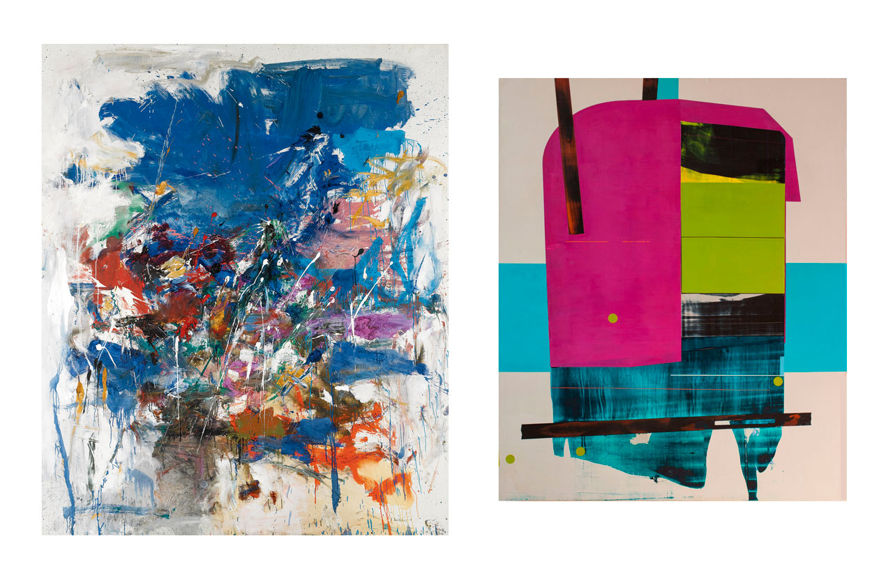
Joan Mitchell, Untitled 95x78, 1960 oil on canvas
Suzanne Laura Kammin, Dictator, 56x46, 2016 oil on canvas
Painting abstractly, you need to develop a language that is unique to you, speaks to you and in doing so speaks to others. The painting process is not linear. When a mark, line or shape appears in your work that makes your heart sing, even if it only whispers of what could be achieved, pay attention!
Developing shapes that express the feeling, mood and magic that you strive for, is a process of learning to see by asking visual questions. Not only in your mind, but with your brush. A combination of experimentation, expression, and the courage to align with the unknown.
Join my monthly newsletter and never miss a post
Each month I share explorations of master artists' works, elements of abstraction, and behind-the-scenes of my own painting journey, delivered to your inbox.